


Little Details Magazine is a newly launched lifestyle magazine that celebrates the little everyday details of life that we often pass by without noticing. I got to be a part of the premier issue (it’s all about hosting, both from the viewpoint of a host and of a guest) both as a creative director and as a contributor. We tried something big from the very start — to turn this magazine into not just a digital one, but into a print one. We ran into many hiccups that we didn’t foresee, but in the end, I was thrilled to be able to hold printed copies in my hands and mail them out to folks who kindly purchased one.

I’ll be taking an indefinite break for now from being the mag’s creative director because of our little babe that’s due in just 4.5 weeks — just to get the hang of all the newness of our expanding family and hopefully I’ll back soon. The second issue is already underway, so go ahead and follow the Little Details blog and its social media for news and updates.
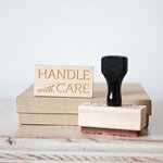
As for the other contribution I made, I got to do a packaging spread where I shared ideas on how to package up gifts for your host, whether it be a box of chocolates or a basket full of goodness. I put up a few photos above taken by Angela Shae, some that made it into the final product and some that didn’t, just to give you a taste — but you’ll have to purchase the magazine either in digital form or in print form to see the full spread. And yes, that’s the cover pictured below via my . Isn’t it fabulous?
Can’t wait to see where this magazine takes us! PS: Now until March 14th, there’s a chance you and two of your friends could win your very own copies of the magazine. Just head on over to the to find out how!

By Anastasia Marie
No comment
Leave a Sweet Comment
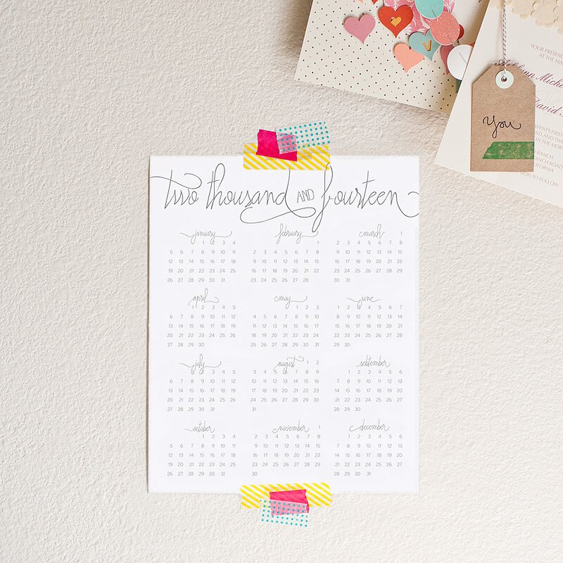
As always, I make my own calendar every year. And I put it up for sale in the shop for those that like it too. This year, I did a simple wall calendar instead of my usual small desktop variation — I’m running out of space on my desk! You can find the calendar here.

By Anastasia Marie
No comment
Leave a Sweet Comment
A Mini 2013 Calendar

This year I opted to do my own calendar — and very last minute. Last year I picked up a calendar a couple months into the year, and I wasn’t going to repeat history this year. I wanted something simple + small and came up with one that I shared on a few days ago. With your response, I have decided to make it available in my Shop for a limited time! So if you haven’t picked up a calendar just yet, here’s your chance! You’ll find it here: Mini 2013 Desktop Calendar.


By Anastasia Marie
1 comment
Leave a Sweet Comment
Omega Business Cards
Everybody has got to have some classy business cards. Fresh from the print shop for Omega Industries:


By Anastasia Marie
No comment
Leave a Sweet Comment
Moving Postcards
A while ago I got to design two postcards for a health clinic to notify their clients of their new location. My favorite? The sweetly peach one.


By Anastasia Marie
1 comment
Leave a Sweet Comment
-
Jennie
You are beyond talented! So pretty yet professional!
- Next Page »
© 2015 Anastasia Marie. All Rights Reserved.
Precioso calendario.